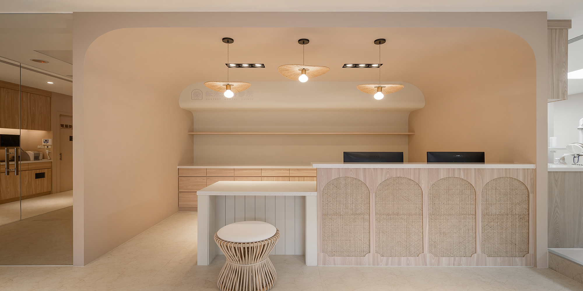
居家大小事,找它有丿步-小工匠工程網

https://lin.ee/YHfAMDp

峻空間設計-診所設計,新竹牙醫診所設計,新竹醫美診所設計
撇步分享文章
文章範例
編貝文青 Dental Hipster

本案基地座落商辦大樓一、二層,總計室內面積約166平方米,主訴牙醫診所規劃。內部分層格局、動線係根據成人、兒童不同診療需求,分別打造一樓成人層與二樓兒童層,而一樓挑高四米餘的充裕屋高,也為後續仰角主視覺預留伏筆。
The base for this case is located on the first and second floors of a commercial building, with a total indoor area of approximately 166 square meters. The internal layered setup and flow are based on the different diagnosis and treatment needs of adults and children as the first floor is for adults and the second floor for children. The ample height of the first floor is more than four meters high, which is also reserved for the subsequent elevated primary visual.
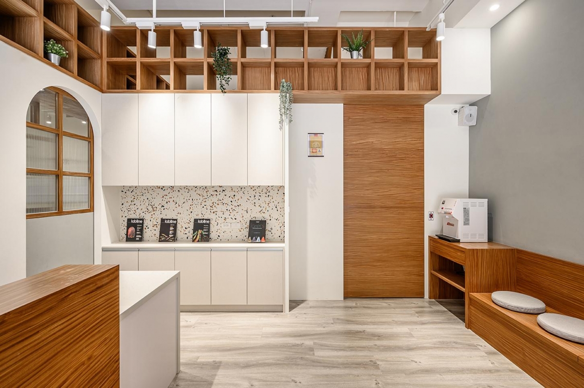

除了一、二樓或沈穩文青、或清新活潑的風格設定有所差異外,相關機能單元配置、動線梳理、材質搭配,也都確實考慮到人員便利性和最佳空間效益。首先一樓為保動線流暢,入口處規劃接待櫃檯與背靠收弧的候診區,並打造弧圓立面、獨立封頂的X光室作為全區軸心,進而衍生環繞X光室往返的U型無障礙動線。
In addition to the differences between the first and second floors or the divide in the calm hipster or the refresh vibrant styles, the configuration of relevant functional units, the arrangement of the flow and the pairing of materials also take into account the convenience for the personnel and optimum spatial efficiency. First of all, in order to maintain a smooth flow on the first floor, the entrance will include a reception counter and a waiting area against a closed arched wall, the X-ray room will have a curved façade with an independent roof as the center of the entire area, which will a U-shaped barrier-free flow that will wrap around the X-ray room.

一樓候診暨櫃檯區,取深淺木質與大範圍柔白做對比,構築溫馨放鬆的氛圍情境。白牆上半銜接雙層半穿透木格櫃,加上修長拱門、刻意不封頂的樑線處理,巧妙牽引多角度的視線流動,一種微復古的文青情懷隨之流露。二樓由於接待兒童患者為主,牆面選用木質洞洞板、OSB板、司曼特塗料、石塑地板等親自然材施作,搭配清新色塊明確象徵單元屬性,在三座獨立診室之間另備一方架高閱讀、遊憩區,有效舒緩孩子們等待過程的躁動性。
The waiting area and counter on the first floor uses a dark wooden color and a large amount of white to an immense contrast and establish a warm and relaxing atmosphere. The white walls are semi-connected to the double-layered semi-penetrating wooden cabinets, the slender arches and the deliberately uncapped beam lines skillfully outline a visual flow from multiple angles and exude a slightly retro hipster vibe. Since the second floor mainly receives infant patients, the walls are made of nature-friendly materials such as wooden perforated boards, OSB boards, cement paints, and stone-plastic floors. The fresh and vibrant color blocks clearly indicate the attributes of the unit as it also has an elevated reading and recreation area amongst the three consultation rooms, which can effectively relieve children of their restlessness while waiting to receive consultation.

其它相關店家資訊
